

- Leverage visual hierarchy
- Use a descriptive, keyphrase-focused headline on the homepage
- Avoid jargon. Use simple words. Avoid long paragraphs and long line length
- Avoid tabs and accordions
- Use people pictures ( Avoid stock photos )
- Use faces as visual cues
- Use color to guide visitors’ attention toward calls to action
- Optimize email signup forms for subscribers
- Mention scarcity, trigger “loss aversion”
https://www.orbitmedia.com/blog/web-design-tips/
https://torquemag.io/2018/07/web-design-tips/
#1 – Leverage Visual Hierarchy
We use use visual hierarchy to guide visitors attention to important elements first. When designing the layout of a website, we consider the positioning of the information (high vs. low) and the size of the element. (large vs. small).
The website layout includes the position (high or low on the page), sizes (big or small), visuals (video, images, icons) and contrast (color and white space). Creating a visual hierarchy determines where the users eye will flow throughout the page. When developed more strategically, it will guide the visitor’s attention through a series of information or message, towards your call to action.
#2 – Use a Descriptive, Keyphrase-focused Headline
You need to answer the question: “Am I in the right place?” Don’t make the headline too vague, make it descriptive and straight to the point. A lot of marketers can get too fancy with their headlines, which can cause some confusion. This is also an opportunity to use a target keyphrase. One study showed that of website visitors spend 80% of their time above the fold. So, it seems like the fold still matters.
#3 – Take advantage of Hick’s Law
Hick’s Law states that the more choices an individual has, the longer they will take to make a decision.
Have you been to In-and-Out? They have a simple menu that makes their long lines go by really fast. Studies show that when you give customers less options, your percentage of them purchasing your product is much higher. Although this does not always apply to all products but more simple products that can be purchased online. When we build a website, we look for ways to reduce the amount of decisions a user has to make such as: limiting form fields, simplified navigation menu, focus on one call-to-action and try to stick to one goal per page.
#4 – Keep it Simple
Simple is more. A huge study by Google has shown that visitors don’t like visual complexity. The more complex your design, the less it is perceived by visitors as beautiful.
Stick to what users know, such as navigation on top bar, logo on the top left, contact button on the top right. People love familiarity and can get weirded out by non-standard site designs. You can find different way to stand out and add some unique design strategically.
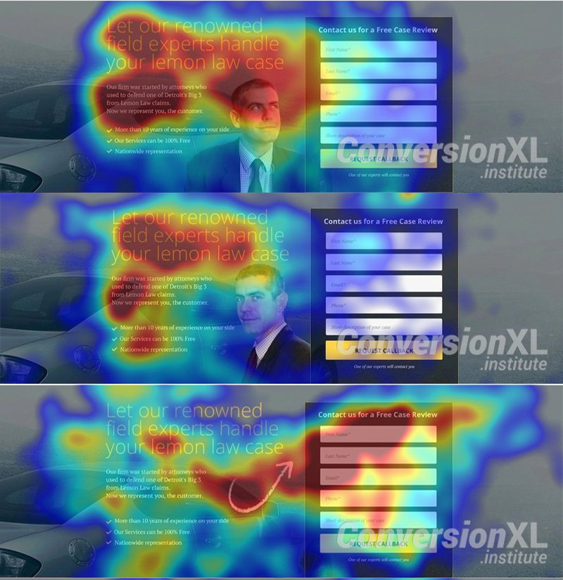
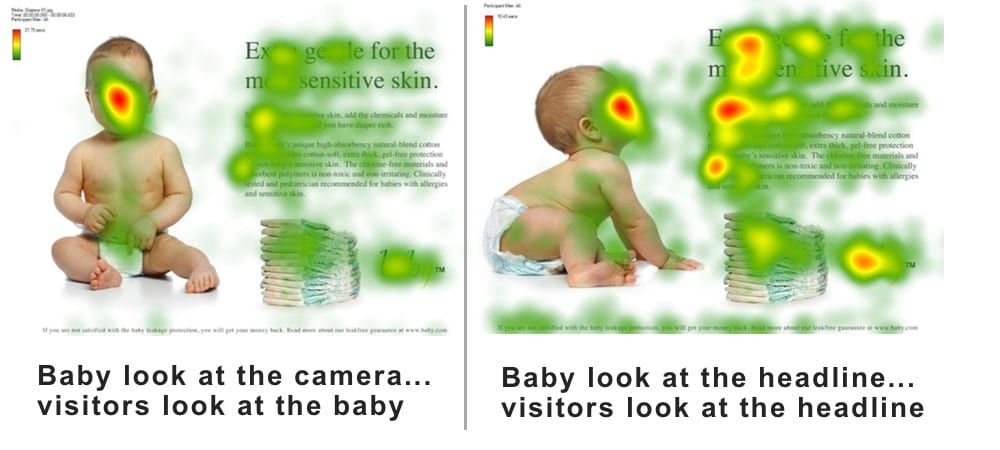
#5 – Use Visual Cues
People pictures give you a special opportunity to guide the visitors attention. The famous “you look where they look” phenomenon. So if your form is locates on the right sidebar, it would be best to have a photo of someone looking toward the right, towards the form. Alternatively, another study shows that using arrows helps even more on giving the user visual cues on where their eyes should go.
#5 – Use color to guide visitors’ attention toward calls to action
Colors have emotional connotations (red is urgent, blue is calm) and they’re part of brand standards. But they are also opportunities to pull the visitors eye toward buttons and CTAs. Keeping these colors consistent throughout the website is important because your training your user how your are using your colors. If used improperly, they may not know if there is button that is clickable and gives you a higher percentage of users leaving your site.
#6 – Avoid long paragraphs and long line length
Long, blocky paragraphs do not align with digital content best practices. Simply breaking up long paragraphs makes the content easier to consume. As a general rule, don’t write paragraphs longer than 3-4 lines. Another design tip is to keep the width of your paragraphs easier to read. The easier it is the read, the more successful the website will be. Use the common words that visitors expect. Long sentences and fancy words force the temporal lobe to work harder. That’s not good.
#7 – Be careful linking to anything on other websites
Whenever relevant, link to things that help the visitor reach their goals. On a blog post, that’s often a citation of a source or link to external references. This post links to dozens of articles and studies!
But on service pages and on your homepage, you should link away to other sites with care. For any page optimized to convert visitors into leads, ask yourself, do you really want visitors to click on that link? Does it help you reach your goals?
#8 – Answer all your visitors’ questions.
More pixels means more space to answer questions, address objections and add supportive evidence. If the visitor doesn’t find an answer to an important question, they can simply keep moving down the page. Once they are satisfied, they’ll simply stop reading. Try to come up with all the questions that your user has, even if it is a question you do not want to answer. You have to give them some sort of answer. You would never cut someone off during a sales meeting and stop answering their questions, would you? That’s all a short page does; it stops answering questions.